We were reminded recently (h/t Parker Gallant) of a website we relied on six years ago for our Climate Emergency Tour (yes, we’ve been here that long thanks to your kind support), namely weatherstats.ca. And it makes an excellent addition to our #Lookitup series, especially for our Canadian readers, since it gives easy access to historical Canadian weather records in a convenient graphical format. Click on the link and the first thing you see is a map of what was once called the Dominion of Canada, and more recently the 51st state, with local temperatures which as of this writing range from the mid-20s C in southern Manitoba to -14C in the high Arctic. By zooming in and clicking on a location you can see a wide range of climate variables including temperature, precipitation and wind, in many places going back a hundred years or more. Oh the fun you’ll have, year after year.
Here, for instance, is the Ottawa temperature record back to 1871. The top line shows the annual (July 1 to June 30) maximum daytime high, the bottom line is the annual minimum nighttime low, and the green line is the average of the two:
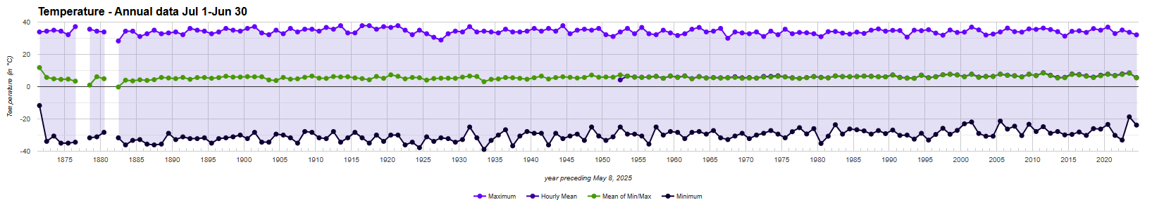
What you can see, if you squint hard enough, is that minimum temperatures have risen a little bit but maximum temperatures haven’t. In fact the peak value of 37.8C was reached five times before the end of World War II, in 1944, 1921, 1917, 1916 and 1913, and never since.
Here is the chart of average wind speed back to 1952, another one of those climate things that everyone knows is getting worse but no one ever bothers to look up:
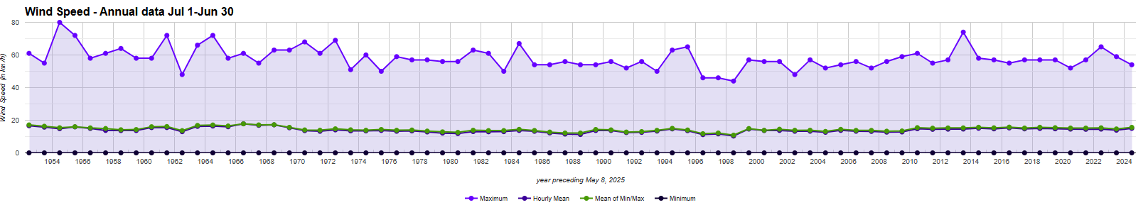
Doesn’t look like a trend to us, except maybe downwards.
Same with snow cover, which goes back to 1954:

The data show either no trend or, if anything, an increase over the past 20 years. Some climate catastrophe this one’s turning out to be. And for each of these graphs and countless others besides, you can get the data as follows:
- Go to weatherstats.ca
- Click on a location
- Select Charts along the top menu
- Pick the metric of interest and select the Annual option
- Under ‘Amount of data to show’ select 10x or whichever scale puts the full record up
Once you get the hang of it you can have no end of fun inviting your alarmist relatives over and teaching them how they too can learn to stop worrying and #lookitup.


Weather stats can also show average temperature increases of course. Calgary for example, shows warming over the graph period of, you guessed it….double the national average. During which time the metropolitan population has doubled from 800,000 in 2000 to 1.6 million in 2026…..the international airport handles 4 times the flights now about 200 per day, and is now has large satellite communities, industrial warehouses, and golf courses in close proximity. The official weather station is at the international airport. Long time gardeners will tell you that the number of frost free days has increased a little wee bit, but unreliably.
I asked Environment Canada to explain the difference between the modelled trend line and the actual trend line in my location (Estevan, SK). The weather station in my location is in the middle of a farm field, not impacted by concrete buildings, roads or runways. They declined to answer the question.