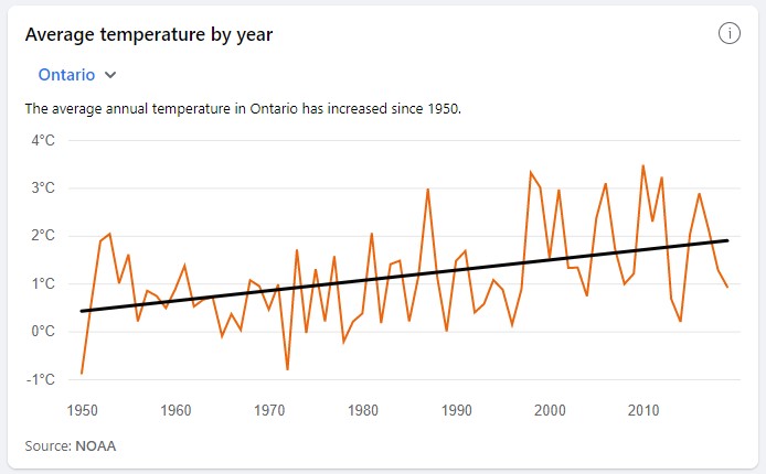
Periodically viewers and readers comment about the annoying warnings social media giants put on our videos not to believe a word we say. For our part we find it funny. But also instructive. For instance when Facebook offers people a chance to “See how the average temperature in your area is changing. Explore Climate Science Info”. Which then takes you to such vital pseudo-information as “The cause of climate change is widely agreed upon in the scientific community” and “The cost of renewable energy is dropping rapidly” and “Overall, polar bear populations are declining because of global warming.” And then, unusually, they managed strike four because, in our case, we also got this chart which, you’ll notice, proves the exact opposite of what the thick black line claims. It shows no warming since 2000, none between 1950 and 2000, and a one-time jump. Wonder what “the scientific community” says about that one. “Nice black line,” probably.
We won’t get sidetracked here into the important question whether Facebook, YouTube and so forth are publishers with broad discretion over content and also responsibility for it, or merely platforms that allow third parties to broadcast anything that isn’t overtly criminal, grossly offensive or contrary to established orthodoxy. But we will point out that this chart is pretty childish.
We will also point out that we checked the source of this data and it was from the NOAA, which is reputable apart from its habit of adjusting numbers to show warming where the raw data doesn’t show any. But also “This section includes data analysis conducted by the Resource Watch team within the World Resources Institute (WRI), a global research organization.” Which is definitely taking sides, because the WRI says of itself “With focused effort and bold action, we can drive systemic change that will improve lives, drive economic growth, reduce inequity, and ensure the natural world can thrive.”
Of course they claim their research is objective, rigorous and peer-reviewed. But if you’re wondering how often they find that climate change isn’t as bad as we thought, or the causal link with human activity isn’t straightforward, well, we invite you to write to them and ask.


Dear Folks, can you help me please? I'm looking for an online source of 'clean' meteorological data - temperature, rainfall, humidity, sunshine hours etc - not massaged by any vested interests. I'd like to do some data mining myself to understand the bigger picture.
Many thanks, Brett.
https://realclimatescience.com/
Some time ago I wrote my own software to download and analyze weather data from the NOAA Historical Climatology Network (HCN) database. The database includes a list of weather stations, what metrics they record, the years they have been active, their geo coordinates, elevation etc.
There are 1,085 weather stations listed in the database, that record temperature, for Ontario. They range from Pelee Island in the south at 41.75 degrees latitude to Fort Severn in the north at 56.0167. Needless to say, there are far more stations in the south than in the north. Their elevations range from 9 m to 150 m.
It turns out that only half those stations have been active for more than 15 years. And only a quarter of them have been active for more than 35 years. In fact, only 14 of those stations have been fully active between 1950 and 2021. And only 5 have been fully active since 1900.
Now, it should be obvious that averaging raw temperatures across stations that are in different climate zones would be meaningless. So I doubt that the chart's labelling is accurate. If it's actually graphing average annual temperature across stations then it's mathematically wrong. Rather, it's likely charting the average "temperature anomaly". But if so, then the chart should also provide the baseline year range.
Climate scientists use "temperature anomaly" to compensate for lattitude and elevation, among other factors, so that temperatures can be analyzed across stations. The way it works is that you pick a baseline period, typically 1971 to 2000, and for a given station you use the daily maximum and minimum temperatures (and the average of those) to compute the daily average for the baseline period. Then, to compute the anomaly for any given day on any given year at that station, you subtract the baseline averages (max/min/avg) from the recorded values. This "delta" shows how much the station's temperature on that day varied from the baseline.
Once you have anomalies for multiple stations, you can average them without the results being skewed by the vast differences which occur between stations that are in different climate zones.
To compute the average temperature anomalies for Ontario for 1950 to 2021, you have to compensate for the fact that only 14 stations have complete records during that period. You have over 1,000 other stations with data, but not for the years you want to analyze. So you have to come up with some means of filling in the missing data.
And that puts the entire exercise in jeopardy. First, you only have 1,085 points of measurement across an area that's over 1 million square kilometers. Second, you have only 14 stations with complete data. Third, it turns out that some of these 14 stations don't even have enough data during the baseline period of 1971-2000 to calculate the baseline averages needed to compute anomalies.
Given these limitations, it seems senseless to try and compute a temperature trend for all of Ontario using surface temperature records all the way back to 1950.
But, what we can do quite easily is compute a temperature trend for single stations and see how they look. Ottawa has a station at the Central Experimental Farm that has been in continuous use since 1885. It's a great location because, though it's within an urban setting and is somewhat subject to the heat island effects of a growing city, it's fairly well insulated from those effects due to the surrounding farm fields and its set-back from streets. Agronomists rely on its accuracy for crop research.
If we look at the Ottawa station (Ottawa CDA CA006105976) what we get is a trend that is about 1.44°C per century since 1890, 2.34°C since 1950, and 1.75°C in this century. In this century, the swings have been up and down such that there's no reliable trend at all. There was a significant jump in 1998. But since then, the trend has been flat -- actually slightly downward at about -1.04°C per century. (But again, the reliability of that trend is very low.)
I've seen this same trend at stations I've analyzed across Canada. I trust rural stations the most, because they are unaffected by urban heat island effects. You simply cannot find a single station that shown a reliable trend that's alarming. Or one where the temperature changes correlate well with CO2 levels. Or where the temperature trend this century is as upward as it was in the 1990's.
Despite my earlier critique of the NOAA chart included in this article, the shape of the temperature line bears a close resemblance to that of the graph I get for Ottawa. On the other hand, with less than 14 stations with sufficient data, most of them in Southern Ontario, it's not surprising that Ottawa might be a good proxy.
Temperatures have gone up ... no doubt about it. But as the NOAA chart shows, they were trending downward until the 1970's, then upward in the 1980's, then down again until 1997, then sharply upward in 1998. Since then the've had slightly larger swings up and down, but with no overall trend. If CO2 is the main driver of planetary temperature, it seems to work in a bizarre fashion because there is no correlation between CO2 and the trend we see here for Ontario.
Brett: the raw data is available at https://www1.ncdc.noaa.gov/pub/data/ghcn/daily/all/. These are the unadjusted records collected from weather stations all around the world. Unfortunately, they are not easy to process. I had to write my own software to download and analyze the data.
For Canadian data you are in luck though. You can get charts of the unadjusted data for various locations across Canada using https://www.weatherstats.ca/. I use the data for Ottawa from that site as an easy cross-check of my data extraction from the NOAA GHCN database.
Note that that site also provides a Cross-Canada view. I can't say whether that view is using the unadjusted data. It might not be.
NOAA GHCN, by the way, sources it's Canadian data from Environment Canada. Another good Canadian source I've used is
https://climate.weather.gc.ca/historical_data/search_historic_data_e.html, but I haven't used it in a long time and I don't recall whether I checked to see if the data was adjusted or unadjusted.
Reply to Brett Trudgeon: possibly https://peratonweather.com will give you the sort of unmassaged weather and climate data you want.
It seems to me that "Scientists" can massage data to get any result that matches their ideology. To slightly misquote Disraeli, " There are lies, damn lies and marketing". Who can forget the Hockey Stick? It's frankly alarming that Michael Mann is still considered to be a reliable expert. Whenever it is hot the main stream media scream climate change, if it is cold we either get silence or "oh, it's just the weather".
Thanks Gary
Actually, they scream "climate change" when the weather is cold. When questioned they will come up with some lame explanation regarding why very cold weather is climate change.