We mentioned previously that alarmists can’t get enough of boiling oceans even though none are to be seen. So they have dispatched ever-escalating rhetoric to do the job of absent facts. And thus UN Secretary-General António Guterres announced that global warming has ended (years ago, dude, replaced by “climate change”) and “the era of global boiling has arrived”. In Ontario as we write these words in late July it is 16°C and we have a heater on at the cottage. What is astounding about this rubbish isn’t just that he said it, it’s that one media outlet after another amplifies instead of scrutinizing it. Reuters “Sustainable Switch” emailed credulously “The era of global boiling” and the Washington Post even ran an “analysis” whining that “As the world boils, a backlash to climate action gains strength.” Or maybe as the rhetoric gets more unhinged people understandably begin to doubt the whole narrative, especially since their energy costs are soaring.
Paul Homewood commented that “It is little wonder only a few people believe in this scam any longer, when the UN chief has to resort to moronic talk of “global boiling” to get his agenda across”. Except if it were a scam, he would be more careful not to say stuff that was laughable. It’s the true believer who rants and raves. And how would you get so many notoriously fractious people as journalists all to join in the same scam and tell the same deliberate lie? Whereas a mass delusion looks exactly this way.
In one of Damon Runyon’s classic noir stories, specifically “Dream Street Rose,” a semi-tactful character says that if something “is not a lie, it will do until a lie comes along.” Which brings us to the infamous graphic from a Lancet study also dealt with in our 2nd Science item this week purporting, in the midst of heat wave hype, to prove that heat is more deadly than cold.
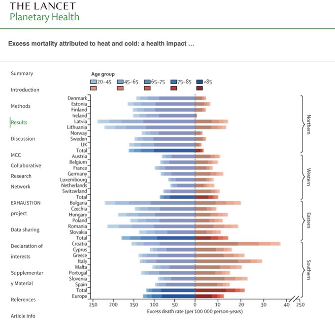
In tweeting it Steve Milloy asked “Can you spot the deception? Even I initially missed it.” And many people, far too many, insist that climate change is a deliberate fabrication. Including otherwise admirable figures like Tony Heller and even Patrick Moore. But although this chart is “How To Lie With Statistics“ 101, we use the analogy not to imply deliberate deceit but to indict zealotry. Indeed, it’s so crude that the completely different scales for heat and cold on the X axis could not fail to be spotted, and hurled in their faces, which no one following cunningly devised fables would deliberately let themselves in for. As they would also not expose themselves to the obvious reproach that cold kills way more people than heat.
The Economist also insisted that “Heatwaves kill more Americans than any other weather-related disaster.” And yet, they noted, Americans are moving en masse to the hot parts of the country. The headline told you what the sophisticates at Economist HQ think of these sweaty, nay scorched rubes: “Americans are moving to places besieged by extreme heat”. Alas, the story said:
“A recent study from Redfin, a property platform, finds that the 50 counties with the highest share of homes exposed to extreme-heat risk grew by an average of 4.7% between 2016 and 2020. The five hot counties that experienced the most growth were in Arizona, Florida and Texas. Williamson County, Texas, which includes suburbs near Austin, grew by a whopping 16.3%. Counties with lots of homes vulnerable to drought, fire and floods also grew, though less rapidly. Places with relatively low climate risk experienced population declines.”
Maybe they’re all idiots, in which case the clever journalists at The Economist can scoop up some soon-to-be-prime real estate at a bargain. Or maybe “climate risk” is a media artefact, one people see through when they’re deciding where they’d like to live. (Oh, and Tony Heller offers a custom software package for querying the U.S. temperature record for yourself. Maybe journalists should try it.)


Funny, all 3 of those states are popular for retirees and seniors in general. Something about cold and arthritis making for a painful existence and how heat feels good on the joints…. Not to mention the fact that the we are in the middle of the Boomer generation reaching retirement age…. Seems to me to be much ado about nothing or a serious case of “duh”.
Notice too that the endpoints of the X axis are both 250 thereby leading you to think each half of the axis represents the same span. To avoid being a complete misrepresentation, there's a break in the axis before the 250 endpoint (shown by --//--) on the heat side to legitimize the different scale. Few people would notice that. It's a dirty trick to make a chart that is designed for comparison and then inflate one side fivefold. No way that was a mistake. They may have even had to produce two different charts and then stitch them together in Photoshop.
They can put any spin on it they want to.But the above heat/cold death stat chart IS fraud and deception,for the reasons explained above.
Yeah, no. I'm not buying the "mere zealotry" narrative. This is so clearly a phony hoax, it isn't even reasonably debatable.
The hottest decade in the last hundred years was the 1930s. The hottest year was 1936.
Does anybody remember the dust bowls of the southwest in the 1930s? A la "Grapes of Wrath"... 1911 was an extremely hot summer, thousands died...don't hear that in the news today...it's all at a minimum hyperbolic BS, and more likely malevolent lies intended to deceive us and manipulate society into giving the government more control over our lives. Wake up people!
As one of those who left Kalifornia for Texas, the 'scorching heat' here this summer is less than it was when I was a kid (I grew up in Texas, and then moved to California to go to graduate school back when it was still a part of the US). It is generally hotter here than the Palo Alto, where I lived for 25 years, but it's not insane, and the air quality (even in the rare instances of there being no brush fires in Kalifornia) is better here in the Hill Country. And I'm allowed to remove the trees on my property which are susceptible to burning, making my current house a LOT safer from fire damage than my previous one.
Actually, my only complaint about the climate here is how cold it sometimes gets during the winters (which are gradually getting colder at the moment).
A bit more subtle than Al Gore's manlift on stage to emphasize Michael Mann's fabricated MBH1998 "Hockey Stick" or the other technique of shrinking the chart borders to make the "stick" pierce the upper boundary.
The pen may be mightier than the sword but it seems the visual image is more powerful than 1000 penned words as it bypasses mediating logic and stimulates emotional response directly. As the population sheds vocabulary and loses the ability to organize and reflect on paper, visuals dominate, particularly computer generated graphics which possess strong rhetorical power, regardless of the quality of the material used to generate them, and lend great "scientific" authority to those who author them.
Eisenhower, the last US president before TV dominance, in his stunningly prescient farewell address, may have been the last to author an informed and politically unmotivated assessment of the future challenges of his country. Though Kennedy lost his campaign debate with Nixon, the "makeup malfunction" credited for his election win, apparently mightily impressed Al Gore and steered him away from pursuing traditional theology to the New Religion and visual evangelism.
True believers now routinely accept "white is black" with photos of water vapour rising from cooling towers, deliberately labelled "carbon pollution", even when not photoshopped or cleverly backlit to appear "dark and dirty". Style guides for government agencies reports which advised "Avoid using the term 'positive feedback' to describe atmospheric temperature humidity interaction, say instead "makes negative effects stronger" or advice to elementary school teachers to tell students, "CO2 is an invisible gas produced by rotting vegetation and dead animals" both numb curiosity and encourage "consensus" thinking.