Another key tenet of the climate movement is temperature extremes. They probably realized that they couldn’t scare people by talking about a slow, gentle warming trend that wasn’t even happening, so they have to paint a picture of scorching heat and wild winter blizzards. Typically, Bloomberg’s Mark Gongloff sneers “If you’re a climate-change denier in the eastern U.S., including the president, then the past few weeks have been a dream. It’s cold and snowy where I live, you might say, colder and snowier than in years. Therefore, climate change is a hoax, just as I’m always saying. Would I be able to hold this snowball otherwise? Check and mate. Unfortunately, extreme spells of winter weather can still happen in an atmosphere made more chaotic by rising heat. The fact that a record-smashing summer heat wave is happening in Australia at the same time that a brutal winter cold is punishing the U.S. illustrates the point.” Or does it? Section 6.3 of the DoE Climate Report looks at extreme temperatures, mainly in the United States. And while hot extremes are going up in some places, cold extremes are moderating and overall the picture suggests that US temperatures are becoming less extreme not more. Which the press somehow never gets around to pointing out.
The report section begins with a review of findings from past and current IPCC and National Assessment reports. Around the world since 1950 there have been more hot weather extremes (although see the story elsewhere in this newsletter for an expose on how this finding for the Netherlands turned out to be an artifact of data manipulation) while cold extremes are getting less frequent and less severe. In North America the picture is mostly the same except there are variable regional patterns: east of the Rocky Mountains there have been fewer hot extremes in recent decades compared to earlier in the 20th century. Since cold extremes are moderating everywhere, the combination implies that in most places temperatures are less severe.
The report shows heatwave days (using a standard definition) in the US in the following graph:
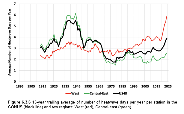
The red line refers to the westernmost one-third of the US and the green line shows the easternmost two-thirds. The black line shows the national average. The 1920s and 1930s stand out as the hottest period due to the intense heat in the east. In the west the last decade stands out, pulling the national average back up.
The DoE team points out that the last National Climate Assessment referred to heatwave counts starting in the 1960s. So the number was rising. But by not showing the whole record they gave readers an inaccurate picture.
The report authors also showed readers the average span of temperatures across the US. In this graph they show the smoothed (15-year trailing average) of the difference between the annual maximum (Tmax) and annual minimum (Tmin) temperatures relative to the long-term average, at every weather station across the country:
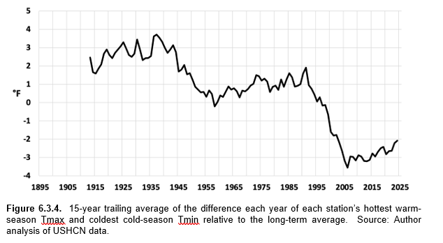
As the report authors explain:
“The average difference for each station between the hottest summer Tmax and coldest winter Tmin has declined by about 5°F in the past 126 years. The decline is due mostly to warmer winter Tmin, but a decline in summer Tmax is also a factor. The rise in Tmin has been strongly related to the growing presence of manufactured surfaces around the weather stations over the last 100+ years (the so-called urban heat island effect).”
So US temperatures are becoming less extreme on balance over time, not more. Is it also true in other places? Possibly, although few countries have long enough data records to check. Still, it’s clearly true in the place we do have proper evidence, despite the media narrative of more and more temperature extremes there.
One more key alarmist myth busted.


"They probably realized that they couldn’t scare people by talking about a slow, gentle warming trend that wasn’t even happening, " that wasn't even happening our 4 words that ruined the entire article ... and don't you realize that the 48 US states are only 1.6% of the entire global surface