When tourists visit the Antarctic, and some actually do, they mostly visit the Antarctic Peninsula (AP), a thin projection of land that reaches a long way north towards South America. And there they learn about the ravages of climate change because the AP is warming (all together now) faster than the global average, putting the delicate local ecosystem at risk, or at least what remains of the delicate local ecosystem after each year’s ice, harsh winds and freezing temperatures have done their worst. A Google search on “Antarctic peninsula warming“ brings up a long list of reports and studies claiming the AP is warming and the Wikipedia page includes a helpful map with the AP coloured bright red to make sure you know it’s fast becoming a sweltering desert. But chill, everyone, because guess what the temperature data just showed.
H/T NotricksZone we learned of a recent study looking at warming and cooling patterns over Antarctica using a new satellite-measured temperature record. There are a few weather stations on the ground in the Antarctic but for obvious reasons not many and not evenly spread out. So the authors of the new study made use of a new data product covering 2003-2021 which was constructed by using satellite measurements of surface temperatures calibrated using the weather stations where available to help ensure that the readings would be accurate over the many areas where thermometers aren’t found.
The pattern of annual trends looked like this:
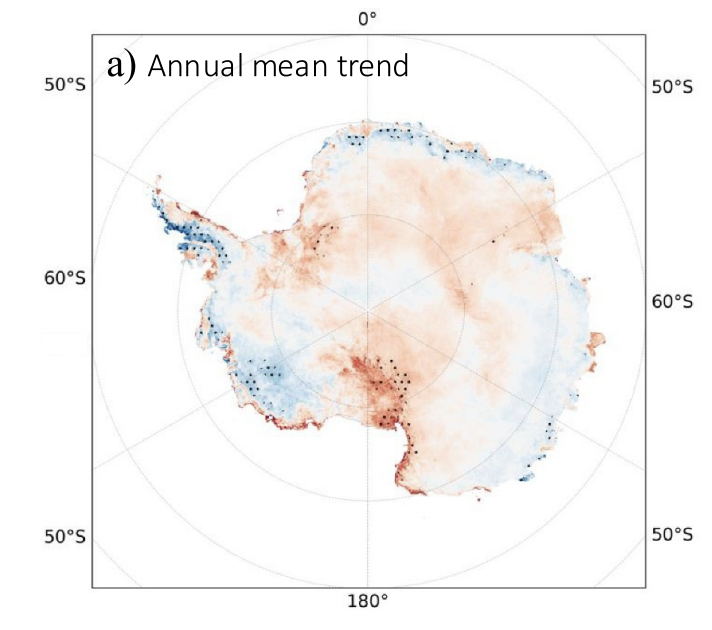
Blue means cooling and red means warming, with dots to indicate where the trend was statistically significant. And notice that the AP, the finger of land in the upper left corner, is mostly coloured blue. With dots. The authors note “Our analysis confirms the recent, significant cooling over the Antarctic Peninsula that has been reported in other studies” although they could also have said, albeit tactlessly, that their analysis contradicts the claim of significant warming that has been reported in the media.
The western coastal region located just counterclockwise from AP and home of the “doomsday” Thwaites glacier the world’s media keeps telling us is melting into the sea, is also coloured blue, meaning it’s been cooling for two decades. But keep going a little further in that direction around the coastline to the 180 degree mark (which we can’t call south because it is north of the middle of the map, as is everywhere around the coast) and you see red. In fact you can see red along the coast of the AP too, on the east side. The satellite data set allows the authors to construct temperature trends at a small spatial scale and when they do that they find nothing much is happening in most places but a few are warming and others, like the AP, are cooling.
Which leads the authors to make a very sensible point. They went into some detail about the regional meteorological processes that drive local temperature changes, including El Niño effects, high pressure systems and all the arcane details that make the climate complicated. The data reveals not an inexorable trend of “global” warming or even the continental variety. Instead it shows regional patterns that produce contrasting warming and cooling patterns, and nowhere in their discussion do they try to claim that CO2 drives everything. Instead they say that if you want to know what’s going on in a place like Antarctica you need to look at the spatial detail because trends in one place may not be the same as trends in another:
“Our study highlights the importance of spatial air temperature data when considering local topography and regional climate interactions for assessing air temperature trends and temperature extremes across Antarctica. The spatial distribution and persistence of warming events were shown to be influenced by complex interactions between regional weather patterns and topography.”
Yup, climate is complicated, even on an empty, frozen land.


The Message is getting through,most intelligent people I speak to have cottoned on to the Fraud,and the Not so Brights don"t understand anyway.
I should qualify the above by saying , When someone tells you something they know to be untrue for their personal gain,that's Fraud. John doesn't like the Word but it's the only word that fits.
Colors may be deceiving. What is the magnitude of change? If it's 5 degrees maybe meaningful. If 0.01 degrees probsbly not.
Lee Howell: That is why the dots on the heat map are important. They indicate that the result has staistical significance, which means that the result is more than random chance. Therefore, any of the heat variation in red and blue areas (most of the map in fact) can be explained away by random chance, or is within error limits of the measurements.
Dave Burgess: It can still be long term natural fluctuation or long term random chance. I'm sure they measured something, but will it hold up over the next decade(s)? As with so many things climate-related, real trends and patterns often only show up after a century or more.