We are revisiting our popular 1919 or 2019? series, this time updated to 1920 and 2020 and relocated to the sunburnt land of our many friends in Australia. We promise to resist the urge to trot out all our Oz cliches (notice we didn’t start with G’day Mate) if you promise not to cheat by looking at the answer before taking your guess. As before the game is simple. We present two records of daily maximum temperatures, one drawn from the safe, cool, pre-climate emergency world of 1920, and one from the post-apocalyptic 2020 hellscape. All data come from the Australian Bureau of Meteorology To start we travel to Albany on the sunny south shore of West Australia. One of these lines is the 1920 daily high temperature record and one is 2020. Which is which?
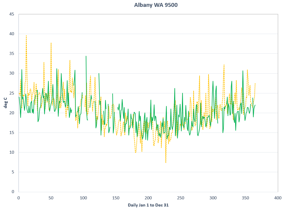
And the answer is ...
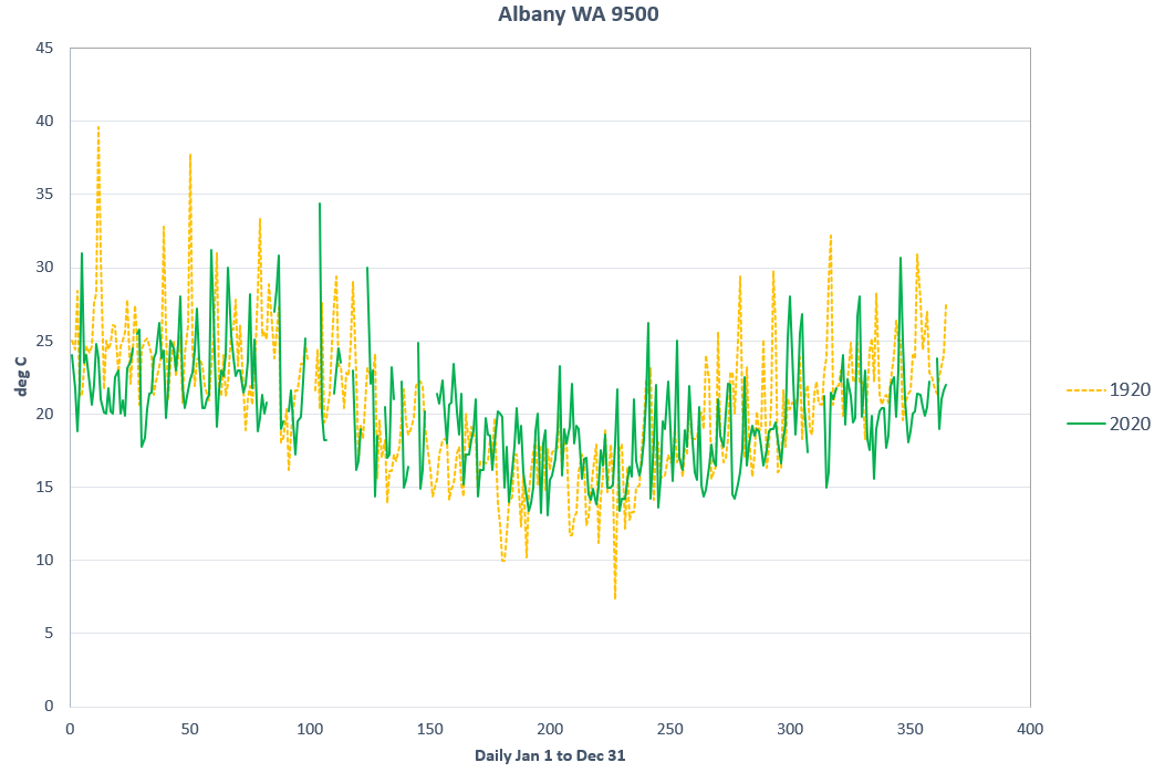
2020 is in green and 1920 is the dashed orange line. Even if you guessed right, if you had trouble deciding, that tells you something about the size of the changes we are talking about when people declare climate change an emergency.
See Comments 
1920 or 2020? Albany Australia Edition
27 Oct 2021 | 1920 or 2020, Science Notes


what a great posts,
thank you
this keeps our minds focused on what is real
Agreed. Another great article from CDN.
I unfortunately had to witness a number of the extinction rebellion 'nutters' setting fire to a pram in Hobart yesterday claiming 'that was what the world was doing to the babies being born today'. They refused to engage in normal conversation about the topic which is there typical standpoint.
Regards
Alarmists use average daily temperatures, which generally show warming over time. Dr. John uses daily maximum temperatures, which negates the Urban Heat Island effect and tends to show stable or modestly declining temperatures over time.
One of them is cheating and I don't think it's Dr John Robson.
http://www.bom.gov.au/climate/extreme/records.shtml
A very helpful table from the Australian Government. The highest temperature ever recorded in Australia was on 2nd January 1960.
We should bring over the 'Maid' and let her show us that this is despicable. ( for a fee naturally ) She can stay at Malcontent's house on the harbour front, if it hasn't already gone under.
Perhaps a touch too coded there, Jeff, unless you mean Grater (the Maid of Stockholm?), and Malcolm Turnbull...?
First, the DMO said that the newspapers of the time reported heat at higher levels due to the equipment used being inferior therefore the DMO had to lower those figures. By, some margin they were mathematically creating, to show the true heating of the world. I believe the newspapers of the day. Then the news was the truth, not opinions, that we get shoved down our throats today.