Given journalists’ habit of tossing out alarmist slogans then adding “scientists say” to the end of the sentence to make it sound authoritative, we are going to turn the trick on its head by reporting things scientists actually said, based on what their research and data told them. Today we look at the hockey stick industry: not just the original Mann graph but the whole business of reconstructing past global temperatures by applying statistical methods to data from indirect “proxies” like tree rings and ice cores, usually done by climate scientists who are not experts in statistical methods. So what happened when two professors of statistics decided to check the results? “We find that the proxies do not predict temperature significantly better than random series generated independently of temperature. Furthermore, various model specifications that perform similarly at predicting temperature produce extremely different historical backcasts. Finally, the proxies seem unable to forecast the high levels of and sharp run-up in temperature in the 1990s either in-sample or from contiguous holdout blocks, thus casting doubt on their ability to predict such phenomena if in fact they occurred several hundred years ago.” Scientists say.
The scientists, in this case statisticians, were Blakely McShane of Northwestern University and Abraham Wyner of the University of Pennsylvania and they were writing in The Annals of Applied Statistics. They took note of the fact that once the proxy data and any direct temperature data that is available have been collected by climatologists, the reconstructions are done using complex statistical methods that McShane, Wyner and their statistician colleagues are properly trained to do. As we showed in our video on the hockey stick, climatologists know how to draw pretty charts. But the real challenge is figuring out whether the chart is scientifically valid or not. Which is where a major problem arises.
Temperature reconstructions use long “proxy” records like tree rings and ice cores to calculate temperatures before careful measurements were taken and for the most part before thermometers even existed. So they require computing correlations between the thermometer data we do have and the relevant recent proxy measurements. But that step is only the beginning.
No matter how pretty the resulting picture, a statistician would then ask whether the correlation is better than what you’d get between known thermometer data and random numbers. Because if it isn’t, the proxies are not “statistically significant” which means because they are not reliable for generating known recent temperatures, they are not reliable for estimating past unknown temperatures. And they’re not. McShane and Wyner ran standard tests for statistical significance and found that “random series that are independent of global temperature are as effective or more effective than the proxies at predicting global annual temperatures in the instrumental period.” Strike 1.
Then they noted that, if you decide to base reconstructions on your data anyway, you have lots of choices about how to combine the proxy data with whatever thermometer data you do have. And you need to choose the method that works best not the one that best confirms your preconceptions. Which is again a significant problem because lots of methods fit the data equally well while giving completely different pictures of past temperatures:
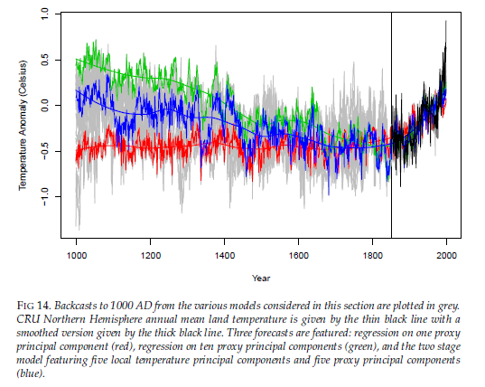
So you need to make a choice, and as the scientists say, “one seems to have no reason to prefer the red backcast in Figure 14 to the green even though the former suggests that recent temperatures are much warmer than those observed over the past thousand years while the latter suggests they are not.” Strike 2.
We’re still not done. Suppose you have picked your data and picked your method and generated a “hockey stick” whose proxy “handle” doesn’t show a rapid rise comparable to the present-day thermometer “blade”. Such a finding, whatever its other defects, also doesn’t indicate something unusual unless you can show that trends never happened in the past, which you can only do if your proxy model can actually detect past trends.
It is of course impossible to test directly. The whole reason for using proxies is that we don’t have past temperature records. But there is a way to test it indirectly, which is to run the model forward and see if the proxies can reconstruct the modern warming we do know about. And they can’t. The scientists say if you discard recent actual temperature records and then try to reconstruct them using the proxies, the models fail to reconstruct the modern run-up in warming, so we have no reason to believe they would have detected such an event or events in the past either. “That the model cannot capture the run-up even in-sample does not portend well for its ability to capture similar levels and run-ups if they exist out-of-sample.” So the absence of a rapid warming in the reconstruction tells us nothing about whether such events did or didn’t happen throughout history. Strike 3.
Scientists say.


Regarding "strike 3": This was known 20 years ago, as a result of criticism of the original hockey stick graph. MBH98 did not display proxy results beside thermometer data where both were available, i.e. in the 20th century, the blade of the hockey stick. Rather, the thermometer data were "grafted onto" the proxy data to "hide the decline." The proxy results showed cooling temperatures in the 20th century, whereas the thermometer data showed warming temperatures; so to get rid of the 20th century "decline" in the proxy data, it was simply scrubbed from the published research. This had to be done, because of both temperature series had been displayed then it would have been obvious that tree rings were not a reliable proxy for temperature. This method of hiding the inconvenient decline in the proxy data was referred to in one of the Climategate emails as "Mike's Nature trick."
It would be great if someone published a graph with the entire series of proxy data up to today AGAINST the measured temperature record so ordinary people can easily see the difference for themselves.
Yep. Surprised this wasn't mentioned.