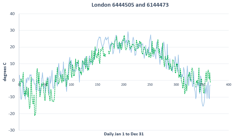
Today’s contest is from London Ontario, down in the southwest part of the province where the previous provincial government put up so many of those ugly wind turbines to stop global warming. And apparently they worked since by 2019 the temperature, which we’re told had been surging uncontrollably since about 1990, was back to being so close to 1919 that we defy you to tell them apart. As always, one of these Environment Canada mean temperature record graphs is 1919 in London and one is 2019 and if you can’t tell which is which, click on the link for the answer.
And the winner is… yes.
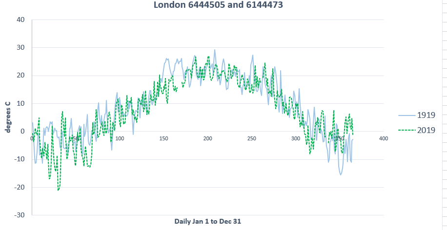
It turns out 1919 is the blue line and 2019 is the dashed green line. Funny thing, though. London Ontario is part of the world and the world wasn’t cooled by a few local wind turbines. So why isn’t global warming visible in this part of the warmed global?
See Comments 
1919 or 2019 Wind Turbine Edition
08 Apr 2020 | 1919 or 2019, Science Notes


My guess is always that the line with discontinuities in it must be the 1919 line, on the theory that data collection has improved in this crucial aspect of public policy. I always seem to be disappointed. The lines with discontinuities always turn out to be the 2019 lines. Maybe the scientists are waiting to see how things turn out before they "interpolate" data to fill the gaps, and produce "record-breaking" temperatures in 2019...
I think you got the wrong idea of a wind turbine. In order to get rid of those hot sweltering peaks in the 1919 chart you turn on the turbine.
Don't you turn on the fan when it is hot and you want it to feel colder? Now then!