Ryan Maue (@RyanMaue for those of you on the Twitter) runs a website called Climate Atlas with two cool data products. Next week we will look at his hurricane data and this week we look at his charts of the JRA-55 Reanalysis anomaly maps. His what? That would be the Japanese Meteorological Agency surface temperature record (“reanalysis”, which means a combination of observed data where available and data generated from 6-hour weather forecast models to fill in the gaps). These go back to 1958, and by clicking on a year and a month you can take a stroll down memory lane and see what the weather was like in the past. The charts are “anomalies”, or deviations from the local long term average, so yellow and red in winter, for instance, means warmer than normal but not necessarily balmy. And with a wave of the mouse you can see the progress of temperatures for that month through the years. Which will reveal some cool things.
Here is the global temperature anomaly map for January 1958:
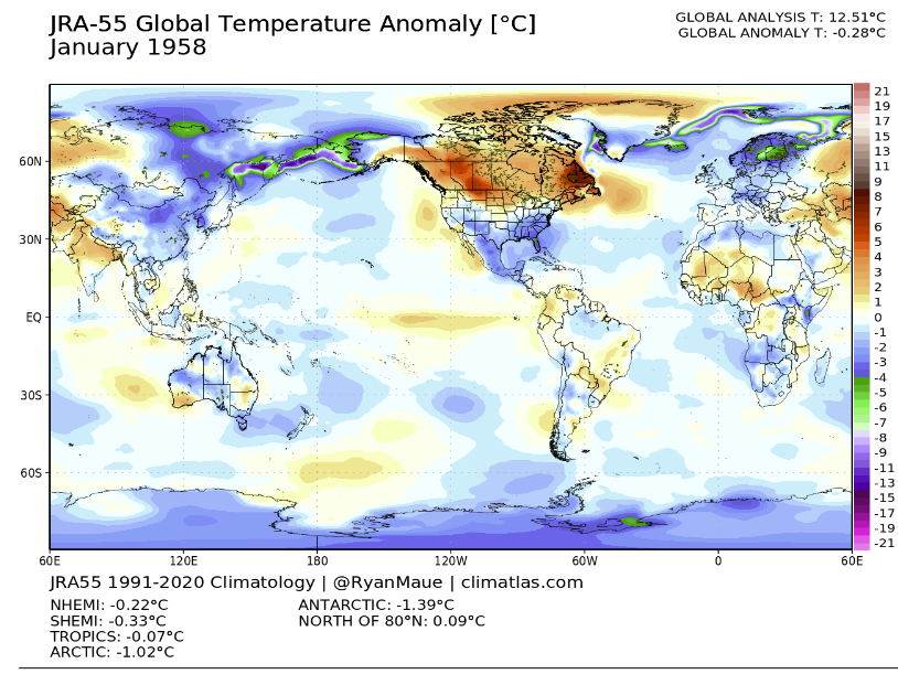
Notice that in an otherwise ordinary winter Canada stood out as way above average. Meaning large unexplained variations in temperature happened many decades ago, long before greenhouse gases were being blamed for large unexplained variations.
If you hover your mouse over the year buttons you can see January 1959, 1960, and so forth all flash before your eyes like a movie. And you’ll see that in the northern regions, most years there are some unusually warm regions on one side of the world and unusually cold regions on the other, as if cold Arctic air gets kicked back and forth like a soccer ball. And you can pick a spot in the world and see how from one year to the next the pattern for a particular month tends to flip extremes. Check out July in Australia or January in Alaska. But not always. October in Europe was cooler than normal over much of the record, as was April in China.
In addition to the historical temperature maps, you can see some charts of average temperatures over time for different parts of the planet. Here, for example, is the global record for the past 10 years:
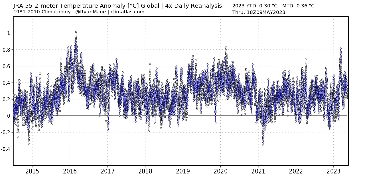
Notice that there’s a spike in 2016, an El Niño year, and since then it looks like it’s been drifting back down to pre-2016 conditions rather than becoming relentlessly hotter as CO2 rises and burns up our planet. And here is the Arctic over the past decade:
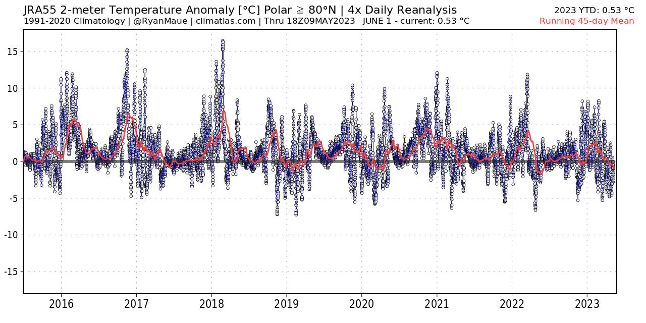
Again it looks remarkably un-catastrophic, indeed absolutely flat with no warming trend even though the Arctic is (all together now) warming three times as fast as the average, or four, or six, or whatever.
You can see an upward trend in the longer charts. But if CO2 is the control knob on the thermostat, why did it disconnect a decade ago? Or was the trend from 1979 to 2015 itself just more random fluctuation?
Certainly the Climate Atlas lets you look in detail at spatial patterns and shorter intervals, and see the remarkable pageant of natural weather variability. Which is cool.


Small quibble John.
“But not always. October in Europe was cooler than normal over much of the record,”
There is no such thing as “normal” temps, there are only averages.
I know you know this so I consider this a typo