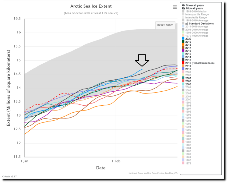
Worse as in there’s a lot more of it. Although if you like ice cover and frozen oceans it will come as good news. Such connoisseurs of picturesque hostile landscapes will be pleased to learn that Arctic sea ice is at higher levels now than it has been in 13 of the past 15 years. According to Perspectaweather, the North Atlantic flipped from a cold phase to a warm phase in the mid-1990s, which was followed by a retreat of Arctic sea ice which reached a minimum around 2008 or 2009. Since then both the extent and volume of sea ice have stabilized, and may be on the upswing. Seems the Arctic isn't done being cold just yet.
The South Pole has long insisted on bucking the warming trend, with its sea ice coverage holding steady or even growing in recent decades. So the more complaisant conduct of the North Pole, with the retreat of Arctic sea ice since the mid-90s, has been a point of pride among alarmists since it allowed their stopped clocks to be right at least once per day. But the picture does appear to be changing there too.

https://www.perspectaweather.com/blog/2020/2/13/715-am-arctic-sea-ice-has-shown-resiliency-in-recent-years
The gray band in this chart shows the range of ice area measurements for January and February from 1981 to 2010 and the coloured lines show the individual years from 2005 to 2020. The past 15 years have been low compared to the 30 years prior. But judging by the blue line (2020) as indicated by the arrow, the ice now seems determined to return to its earlier average. And the satellite map shown on the Electroverse site shows sea ice even extending out past the 1981-2010 median extent in some areas, such as north of Alaska.
Had the data been otherwise, with sea ice extent still hitting modern lows, the news would be in all the papers. The fact that it's trending the other way somehow doesn’t seem to furnish inspiration for headlines.
Commenting on this phenomenon, CO2Science quotes a paper that asks whether the problem is “inaccurately simulated change of Arctic sea ice extent or effects of associated physical processes under increasing anthropogenic emissions” and says “our bet is on the latter explanation”. Surely the real question is why the models don’t just inaccurately simulate such impacts, but always seem to botch it in the same direction when monkeys throwing darts would miss about equally often on each side.
OK, it was a leading question. It’s obvious why 97% of the mistakes, to invent a number, are on the side of unreasonable alarmism, itself always subsequently proclaimed to have been insufficiently alarmist. The models and studies are designed to scare us into acting, not to find out whether we should be scared.
The question is at what point people start not merely tuning out the warnings, as they largely already do, but resenting the distortion.
We’re there already.


