H/T No Tricks Zone we learned of a new study in a journal called Current Problems in Cardiology (to borrow a line from Rex Stout’s Archie Goodwin “which we did not read regularly”) that looked at the effect of temperature on death rates in the United States. And they found, as others have before them, that cold is much more deadly than heat. From 2000 to 2020 there were just over 72,000 deaths in the US attributable to cold weather, and only about 6,000 attributable to hot weather. Making cold 12 times deadlier than heat. But they also looked at economic conditions in the areas being studied. Heat deaths didn’t change much but the poorest areas faced double the risk of cold-related deaths compared to the richest. So in response to the risk of, ah, warming, governments are putting in place policies that drive up costs and make us poorer and more vulnerable to the real threat, namely cold. Why do they hate us so?
The authors of the new study used data from 1,514 counties across the US covering a total of 33,395,241 deaths between 2000 and 2020. When they compared death rates to local climate they found the optimal temperature (i.e. minimum mortality temperature) was 22.7°C. When the weather gets warmer than that level, mortality rises, and when it gets colder, mortality also rises. The U-shaped relationship looks like this:
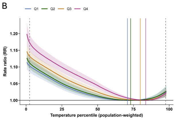
The horizontal axis shows temperature re-weighted to represent the local population exposure (so counties with fewer inhabitants don’t skew the result), then turned into a percentile scale from 1 to 100 (so that, for example, you can see that more than 75% of the population experiences temperatures lower than that associated with minimum mortality). The vertical axis shows the ratio of deaths at that temperature relative to those at 22.7 °C, which is where the curve bottoms out. The differently-coloured lines represent different levels of wealth, measured using something called a Social Vulnerability Index, so the lower your number the less vulnerable you are to various things including undesirable temperatures. So blue and green show death rates for the least vulnerable while yellow and pink show them for highest, which generally means the poorest and hence least able to act to mitigate undesirable situations.
As you can see, as temperatures drop below the optimal 22.7˚C, moving left on the axis from the point where every group’s likelihood of perishing is normalized to 1.0, all groups experience rising rates of mortality, but the rate rises about twice as fast for the pink group (the most vulnerable) as for the blue group (the least vulnerable).
So what should we do to save lives? For starters, concentrate on policies that increase economic growth rather than depressing it. Especially since measures that depress growth to prevent warming are a double-whammy because a warming trend means most people will experience weather that poses less and less risk of premature mortality, while rising income means people become less vulnerable to the weather.
So if the alarmists are right that fossil fuels are causing both warming and increased wealth, then hooray for fossil fuels. And if the government wants to stop both warming and wealth, as they seem determined to do, then boo governments. And in the meantime we also say boo to this frigid winter weather that still afflicts us in Ontario well into April.


blaming heart attack deaths in the winter on the temperature makes no sense when you blame them on heart disease during the rest of the year. ... at best warmer , a major characteristic of greenhouse gas warming, would extend the lives of some heart patients ... but they would still be likely to die from a heart attack ... it's impossible to know the effects of a warmer winter on heart patients because of confounding variables of excess weight and lack of exercise
Yes it is still a crummy spring in Ontario so far,with temps only 6C and raining as I type this.The best place to live for moderate temps would be the West Coast.Too bad that the political Left from BC all the way down to California has wrecked those places.With woke policies in every aspect of life.From climate alarmism to high taxes to soaring crime to homelessness/drug culture to DEI failures.Which is why in CA at least,the U-Hauls are mostly leaving there,not arriving.