This week we start a new series devoted to showing readers where to find interesting and useful climate data sources online. We’ll use the tag #CoolClimateData in the heading so that as the list accumulates, if you want to find them all, just go to our website and type #CoolClimateData in the search bar. We start with the Rainsphere web page developed at the Center for Hydrometeorology and Remote Sensing at the University of California-San Diego. It gives you a worldwide view of rainfall rates and trends. You can zoom in wherever you like and choose any date range between 1983 and the present, then look at average and total rainfall or trends over time. And you can compare observed historical trends with IPCC model predictions. Which is a temptation we can’t resist.
Here is the satellite-based record of rainfall trends around the world from 1983 to the present:
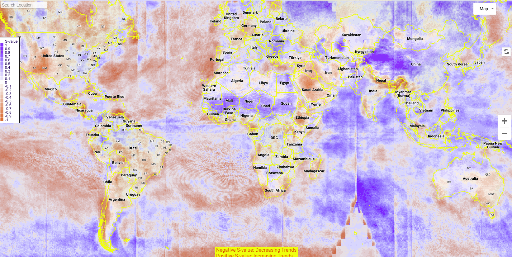
Red means less rain and grey-purple means more. Here are the projected changes from the present to 2100 based on the IPCC RCP4.5 Scenario:
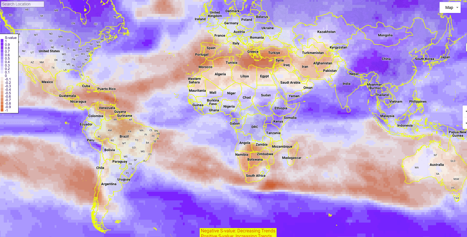
Look carefully. Notice something unusual? The changes projected in the future due to global warming don’t look much like what’s been observed over the past 40 years. Canada, the Antarctic region, the US and Europe got less rain since 1983 but the IPCC expects rain to go up. North Africa got more but is expected to get less. The Indian Ocean between Australia and Africa also got more but is projected to get less, while the opposite holds for the Pacific Ocean west of Ecuador, Colombia and Peru.
Some places match, but no more than what you’d expect with random chance. But aren’t we already being told that climate change is here? And the climate models are accurate?
If both claims were true the patterns we’re observing after 40 years of rising GHG levels should look a lot like the patterns predicted by the models under rising GHG levels over the coming 40 or 80 years. Instead they look like a few lucky guesses and mostly a lot of wrong ones.
To which we say, cool.


"Red means less rain and grey-purple means more."
I don't get it. Canada is entirely grey-purple, which means more rain. You say, "Canada... got less rain since 1983 but the IPCC expects rain to go up." Haven't you got things backwards? Wasn't the IPCC in fact right about rain trends in Canada, based on this map?
Oh, sorry, was looking at the wrong map... You got it right.
Veo más lluvia en general,excepto África del Norte,España ahí el rojo se intensificó
And of course you cut my country off the map. Hans Wormhat would be pleased. The tutorial demonstrates region after region with no significant trend. What are the units of the "S value"?