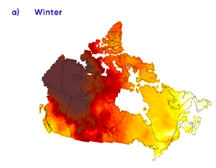
 Governments like to show us what climate change looks like by drawing coloured maps like this one, which is from the 2019 Canada’s Changing Climate Report (page 126) and purports to show 70 years of wintertime warming across the country. As the colours go from yellow to red to charcoal they indicate places getting hotter and hotter. And we worry that people might look at that map and think the colours mean, well, the far north is now hot in the winter, which could make for some very disappointed tourists. So we will look at places in the sunburnt lands of Canada’s Arctic that have temperature records at least back to the 1930s and show you what their climate history really looks like. This week we start in Mayo, Yukon Territory, right in the middle of the inferno. And it seems that mayo has been in the fridge.
You can find the charts at YourEnvironment.ca, which gets the data from Environment and Climate Change Canada. Each graph shows the monthly average daytime high for one particular month, in Mayo’s case from 1925 to 2018. Here are January, February and March:
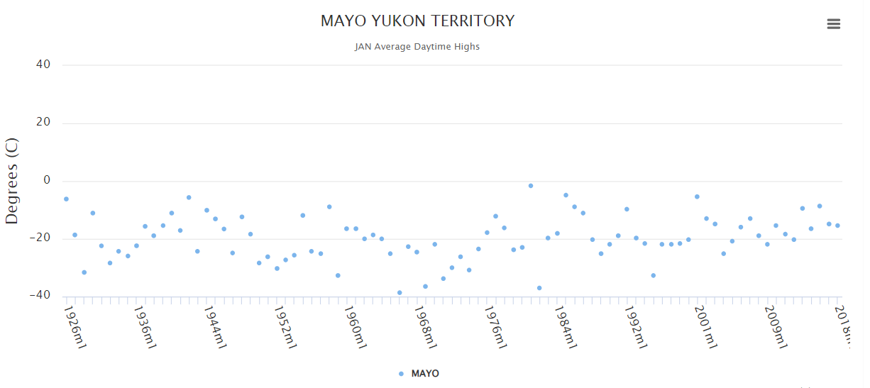
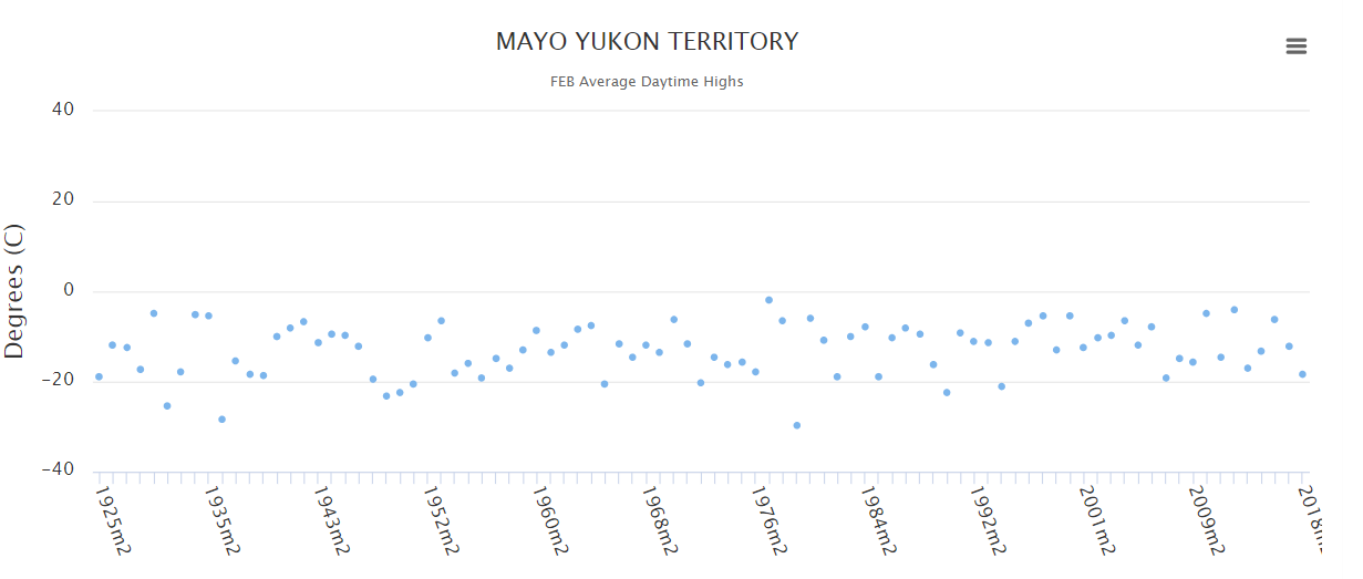
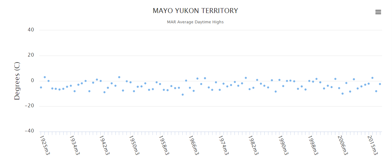
You’ll notice that they’re pretty much flat lines, not an oven preheating. There are fluctuations; there were some truly nasty Januarys in the 1950s and 60s before temperatures climbed back into a range like in the 1930s, typically around -10C to -20C. And while February has been pretty steady in a range between 0 and -20C, March bounces between -10 and +5. So, not great tanning weather. Or great panicking weather. So we’ll keep looking for the heat up north next week.


I visited Prince zPatrick Island, NWT in 1975 and upper Ellesmere Island in 1976, and would like to see their comparative temperatures for every month.