This week and next we will discuss a pair of recent papers in the peer-reviewed literature that, somewhat surprisingly but commendably, offer honest words of caution about paleoclimate reconstructions and what they truly tell us about how the current warming trend compares to the past. We have delved into the uncertainties of the paleoclimate topic previously (here for instance) because so many alarmists insist that the Earth is warming “faster than ever” as if we somehow knew what the climate was doing to a hundredth of a degree a million years ago, or even a thousand, including the pace at which it rose or fell in individual centuries or even decades in the Cretaceous or the Permian or even the Oligocene. And the topic tends to draw our attention because it is the favourite sandbox of the notorious Michael Mann. Our view is that while paleoclimate proxies can give useful information at the local level, the data for reconstructions at the global level are far too sparse and imprecise to be conclusive especially given the ease with which scientists can engage in cherry-picking. And over any sort of geological time scale too much detail is lost due to averaging over very long time scales to make any useful comparison with the past few decades, centuries or even millennia. The second new paper, which we will cover next week, proves the point about geological smoothing. The first, which we discuss this week, looks at the cherry-picking problem, and offers some surprisingly blunt criticisms of the IPCC.
The paper, titled “The IPCC’s reductive Common Era temperature history” appeared in Nature Communications, ordinarily a secure bastion of IPCC orthodoxy. The list of 15 authors, headed by German climatologist Jan Esper, include some of the best-known names in the paleoclimate field so this isn’t just a bunch of amateurs the IPCC can easily ignore. The authors point out that in the 2001 IPCC report (nicknamed the TAR or Third Assessment Report) the IPCC highlighted the Mann hockey stick even though other reconstructions were available:
“Despite featuring the Hockey Stick exclusively in the 2001 WGI SPM [Working Group I Summary for Policymakers], other NH temperature reconstructions were also available at the time.”
No kidding. In our Hide the Decline video we exposed the sordid background story of how the IPCC at the highest level allowed Mann to hide the other data that didn’t agree with his to make sure the picture told a “nice tidy story”.
In its 2007 and 2013 reports, after enduring withering criticism, the IPCC produced new paleoclimate charts showing many different reconstructions that revealed considerable disagreement and uncertainty. Which to some degree is a vindication both of climate science generally and of the IPCC in particular since both appear at times to ignore legitimate disagreement but clearly feel some pangs of conscience behind the scenes.
Unfortunately, the new paper notes, in 2021 the IPCC reverted to form by selecting only one reconstruction and ignoring all the others:
“In an approach that parallels the 2001 SPM, the 2021 WGI report returned to a single representation of purportedly annual temperature variability, this time a global estimate over the entire Common Era (Fig. 1d) derived from a single study that uses a subset of the 692 proxy records compiled by the wider paleoclimate community. Similar to the case in 2001, this was not a necessary choice, given that several reconstructions of global temperature fields over the CE were available, in addition to earlier index reconstructions of global mean CE temperatures.”
And then Esper et al. get to the heart of the problem. IPCC authors know full well that these kinds of charts have a big political impact, and by cherry-picking one that shows only what they want readers to see they are misleading the public and policymakers (emphasis added):
“Visual summaries of the current scientific consensus in IPCC reports are powerful and impactful. IPCC figures are used widely by scientists, policy makers, and climate communicators, and are often the go-to source for the state-of-the-art representation of our scientific understanding in many subdisciplines of climate research. It is therefore worth noting that the visual impression of the reconstructions shown in the 2007 and 2013 IPCC reports, themselves an important evolution from the 2001 representation, vividly demonstrate a very different sense of the uncertainties in our understanding of large-scale CE temperature variability than the 2021 representation.... We argue below that the 2021 visual representation of the state of the science pertaining to large-scale CE temperature reconstructions was insufficient, misleading, and cut against efforts in previous reports to represent the range of estimates and uncertainties associated with these reconstructions.”
Here’s the graph the IPCC showed in 2021 (called “PAGES2k”), representing temperatures going back 2,000 years and ending, of course, with Mann’s blasted hockey stick blade:
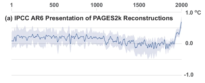
But Esper and his coauthors argue that the uncertainty bands (gray shading) are implausible, especially because they don’t get wider as you go back in time even though the data get more and more sparse. And, worse, everything is based on a single study. Yet taking into account the available data and the many different methods of doing the reconstruction, there are thousands of potential reconstructions.
They then suggest an alternative way the data might have been shown by the IPCC. But here we come up against the limits of what you can expect from mainstream paleoclimate scientists publishing in a Nature-connected journal.
They present a few reconstructions, enough to show that there is very little agreement about temperatures a thousand years ago. But those they select do ensure that the current era is the warmest yet. And they don’t confront the problem that stitching modern thermometer records onto historical temperature proxies is itself a form of deception if we don’t get to see all the possible graphs that could result with equal claims of validity, the point of the criticism by McShane and Wyner we discussed earlier.
Esper and co. do offer some comments about the way proxy records like tree rings miss important detail over time which makes it hard to compare to modern temperature records. But for a proper deep dive into that subject, you’ll have to wait for next week.


