The US is uniquely prone to tornadoes, and despite what the alarmists would have you believe, it has been since long before whenever it is that man-made climate change allegedly hit. So this week in our #Lookitup series we start with an overview essay by Roger Pielke Jr., provocatively titled “What the media won’t tell you about tornadoes” (plot spoiler: everything). And then we tell you how you can look up some of the key data showing why the experts in the field have concluded tornado trends this century are going down, not up.
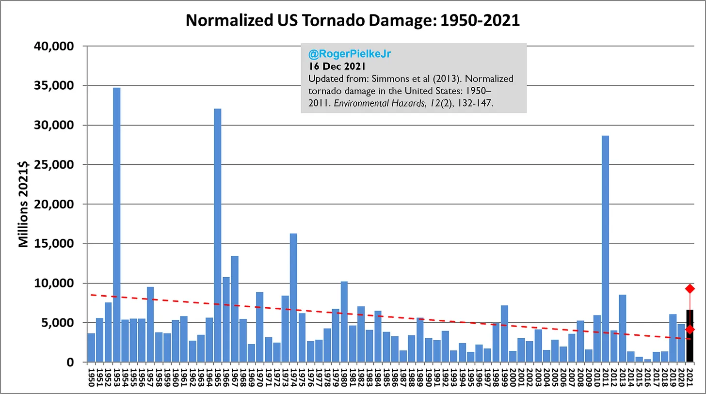
In Pielke Jr.’s essay he draws a distinction between hurricane numbers (declining) and hurricane damage (increasing). The latter is sometimes used as proof of climate change but as we’ve often noted, this inference is invalid because due to economic and population growth not worse weather there is more stuff and more valuable stuff in the path of weather systems these days. And indeed if the damage record is adjusted for the growth in population and the size of the economy, the trend in damages goes down:
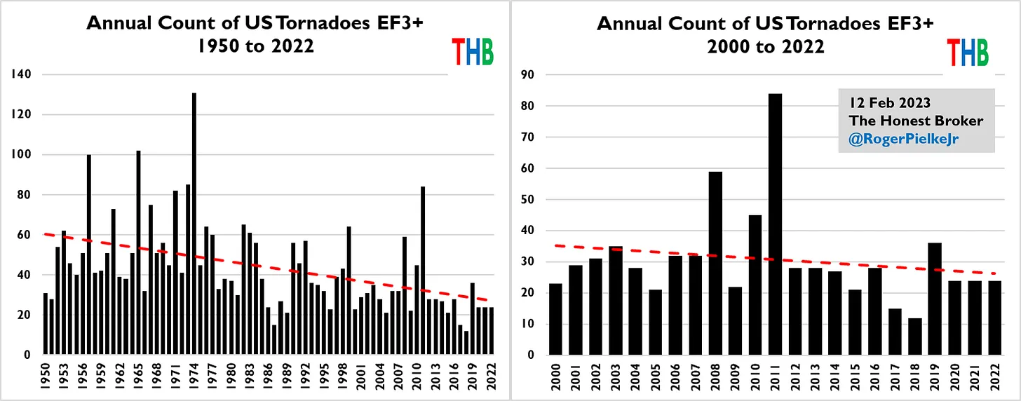
The count of extreme tornadoes, called “EF3+” (for “Enhanced Fujita Scale 3+” after meteorologist Ted Fujita) from 1950 to 2022, and in closeup for 2000-2022, charts in this wise:
What about all tornadoes? Here we get into the problem that prior to the development of Doppler radar in the 1990s, annual counts were incomplete. Small brief tornadoes might have appeared and disappeared without anyone noticing them. The record of large tornadoes is likely reasonably complete because they are hard to miss, but the record of small tornadoes is probably not since prior to the mid-90s not all were counted. With that in mind, let’s look at the record, which you can look up at the US National Centres for Environmental Information website here. Select the 12-month timescale and “All Months” range to get the annual totals. Then slide the bar at the bottom of the chart to the left to reveal this picture:
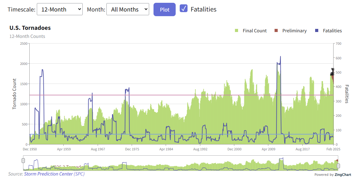
In generating this chart we also selected the option of overlaying the number of fatalities which, other than in 2011, has been trending down. It’s the purple line. And really the metric should be fatalities per hundred thousand population since the number of people in the path of tornadoes has gone up. But even without that adjustment the death toll is clearly not going up.
There is a definite jump in the number of tornadoes in the early 1990s which, as we noted, is probably due to the introduction of the radar monitoring systems that ensure all storms are now recorded. So we can zoom in just on the past 30 years and we get the following:
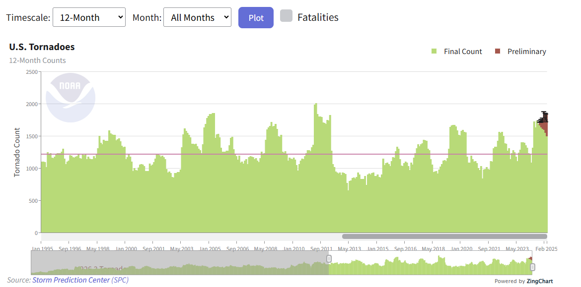
The red line is the average not the trend line. But the takeaway from this chart is that there is no overall upward trend in the number of tornadoes over the past 30 years. And if anyone tries to tell you otherwise, you can tell them how to #Lookitup.


