This week we go to beautiful Cape Leeuwin on the southwest coast of Australia, where the Southern and Indian oceans meet, to draw together the daily temperature records for 1920 and 2020. As always, see if you can guess which is which, which should be easy after a hundred years of the climate crisis.
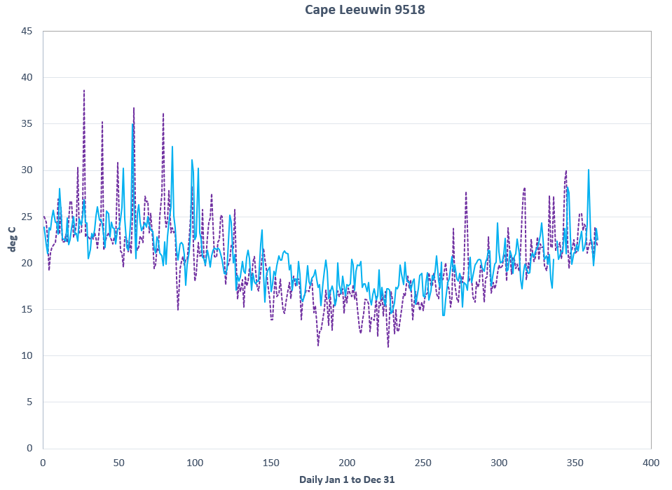
Here’s the answer:
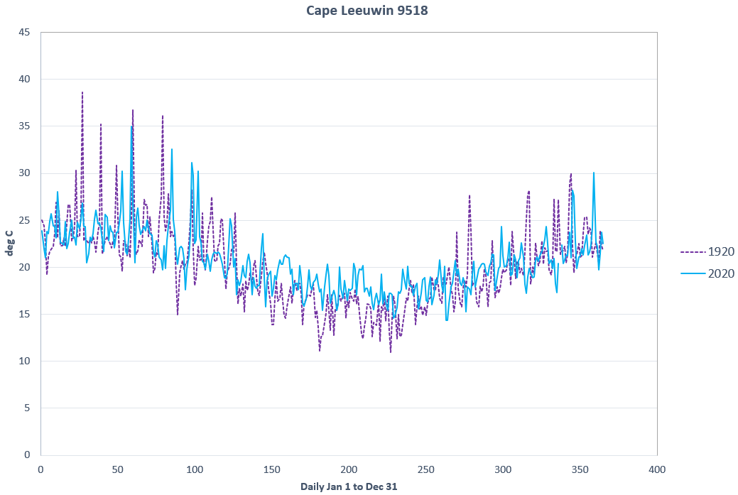
Yes, the dotted purple line is fine and the solid blue spells doom. But if you guessed wrong, don’t worry. You can hardly be expected to spot every existential crisis that makes the rounds. Better luck next week.


This series should have it's own section as opposed to being within Science notes. So much fun.
That, right there, shows the fallacy of the extreme temperature brigade. Summer peeks now the same, or maybe less, winter lows slightly higher - there is your warming. And begs the question - whats not to like - unless you are a skier?
Actually, I now find these usually straight forward to work out:
1. Work out when winter is for the particular place (eg in the middle of the graph for this Australian location)
2. See which graph has warmer temperatures during this period, and…
3. That’s the 2019 graph!
It’s not particularly clever, it’s just that we all get caught up looking at the big peaks in summer temperatures, but we have long known that the (limited) warming (that has occurred) particularly:
1. Occurs away from the Equator
2. Occurs at night
3. Occurs in winter
…so you can see how that would lead to the extinction of humans; not!