Or should we say lack thereof? Dr. Roy Spencer, of the Christy-Spencer satellite data set fame, has posted an analysis on his weblog of Canadian summertime (June, July and August) temperatures, namely daytime highs and nighttime lows, from southern locations across six provinces from 1900 to 2023. His analysis used the Canadian data in the Global Historical Climatology Network (GHCN) archive and the findings are very clear: nighttime lows trended up steadily across 124 years of the sample, but daytime highs did not. They followed a gentle cycle, peaking in the 1930s, falling through the 1980s then rising again afterwards:
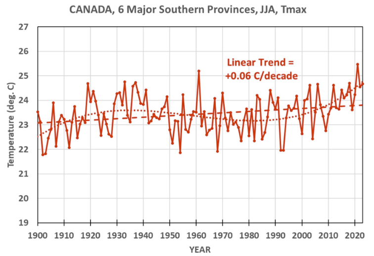
Daytime highs trended upwards by a non-blistering 0.06 degrees C per decade, which amounts to just under half a degree per century. Just another of those relevant pieces of information that the government never seems to get around to telling us, in the midst of yelling about the climate crisis. Along with the one where rising lows and immobile highs is a known tell-tale sign of… the urban heat island effect.
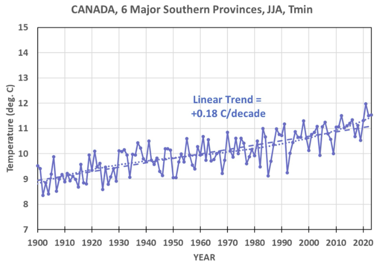
Here is the corresponding graph for nighttime lows:
The data cover BC, Alberta, Saskatchewan, Manitoba, Ontario and Quebec. And here’s something else really weird. The number of weather stations in those six provinces has changed dramatically over time. In the last half-century, with rising concerns about climate that presumably create an urgent need for ample reliable data, it has… fallen sharply:
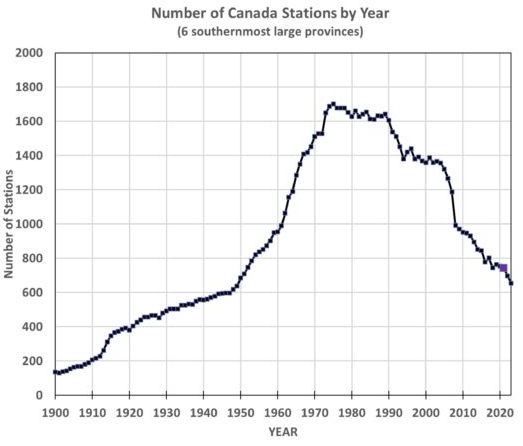
If the authorities were going about saying the weather’s so normal it’s hardly worth looking at you could understand this kind of parsimony even among the general flood of state profligacy. But instead they’re yelling about a climate crisis, making it very weird that the number of weather monitoring sites peaked in the 1970s and as of today the number of active stations is back down to about where it was in 1950. (While there are still lots of thermometers across Canada, this graph is measuring the number that provide records to the GHCN, which is what all those scary graphs of global warming are based on.) Did the great culling of thermometers affect the trend shown in all those government reports? Heck no, experts say, because reasons.
Spencer dealt with the changing sample size by working out an algorithm for adjusting the values of each new series as it entered the sample to compensate for differences due to location and equipment. The details are at his site, and they matter because in the first two posts in his series he didn’t apply the adjustments and got a slight cooling trend in the summertime daytime highs.
Spencer also shows the results for each province individually and they are remarkably consistent: a little warming of the nighttime lows, and almost none in the daytime highs. The Dust Bowl years show up clearly on the prairies in the daytime highs but not the nighttime lows. And 1961 looks to have been especially hot out west.
Spencer has worked on multiple satellite monitoring missions carried on NASA rockets. This kind of study, by comparison, is not rocket science, lots of people could have done it. in fact we have an entire federal bureaucracy devoted to studying climate change including collecting data and yelling about trends, but somehow they never got around to showing us the data or checking their rhetoric against it.
So we are grateful that there are scientists out there like Spencer willing to do it and make sure to stay tuned as we continue to report on their efforts.


While the total GHCN database contains more than 100,000 stations worldwide, only about 20,000 to 25,000 are regularly updated with new observations. In Canada, specialized datasets like those for adjusted and homogenized daily data currently include 338 temperature stations and 463 precipitation stations.
In 1950, there were approximately 1,500 to 3,000 active temperature stations and 2,000 to 3,000 active precipitation stations in the Canadian network that contribute to datasets like the Global Historical Climatology Network (GHCN).
Before 1950, weather station coverage in Canada's northern regions was sparse. Models for the period 1901–1949 often cover a reduced area (up to 60° latitude) compared to the more extensive post-1950 data. ... Spencer's study is worthless. He cherry picked three months of the year in one nation rather than 12 months of the year globally. He told us what was already known: More warming at night is a symptom of greenhouse warming from CO2 emissions. UHI warming is a very minor cause of night warming. TMIN warming in the six coldest months of the years = the primary symptom of CO2 emissions. The statement that CO2 warming is weakest during the summer months is generally accurate when considering the seasonal cycle of atmospheric CO2 concentrations, primarily in the Northern Hemisphere. Canadians should celebrate CO2 warming. We love CO2 warming here in Michigan.
@Richard Greene: The point is not the cause of the temperature change. It's the fact that only the lows are increasing, which means that weather will become calmer, more predictable and generally nicer. This is completely contrary to alarmist claims that the seas are on fire.
Oopsy ...
"Daytime highs trended upwards by a non-blistering 0.06 degrees C per decade, which amounts to just under half a degree per century."
You mean to say "... just OVER half a degree per century." 0.6 is just over 1/2 or 0.5