There’s a famous climate graphic, available on all kinds of merch from shirts to mugs to, yes, a COVID mask, and used by Greta Thunberg as the backdrop and cover for her new book updating the Communist Manifesto, that shows the temperature since 1850 shading from cool reassuring blue to scary dark red. And while you may complain that it’s cherry-picking to start near the bottom of a famous natural cooling period, well, the whole alarmist shtick about 1.1°C of warming depends on it so don’t blame the graphic artists. And don’t blame them for trying to make the visual presentation compelling, as it is rather the point of graphics. On which basis we ourselves have done the same graphic except we show you the last 400,000 years and yes, it’s still scary.
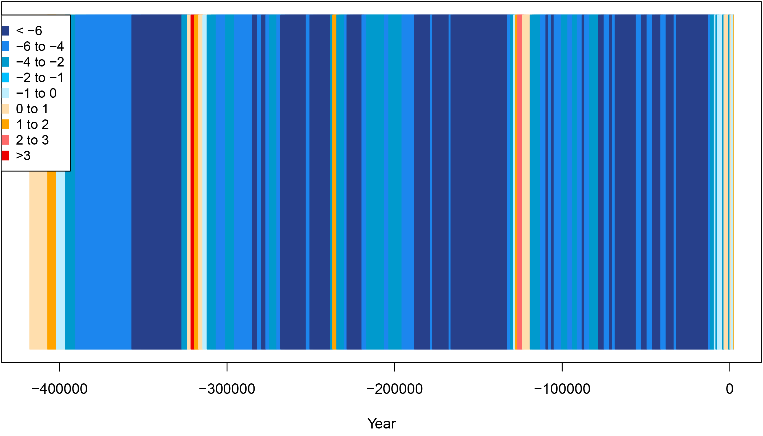
Except this time it shows that our once warm and lush planet has spent most of that time worryingly cold and inhospitable to life. And despite the faint glow of blessed warmth very recently, though nothing like as warm as during previous interglacials that did not see those fabled “tipping points” or a “runaway greenhouse effect”, it’s troubling to think that probably that little narrow orange band will, like previous ones, soon give way to scary dark blue. But until that actual climate disaster happens we’re working on merch of our own.
While we were working on our own graphic, someone else did a modified “warming stripes” that showed the Medieval Warm Period, the Little Ice Age and the modern warming, making the (to us) obvious yet still essential point that it was warmer 800 years ago, modern conditions are not unprecedented or even worrying, and there’s something fishy about insisting that cycles that have existed since before the Holocene interglacial even started were entirely natural until 1850 and then mysteriously the natural forces were shut off and humans took over. And we will be bringing you other versions of our own graphic showing lots of different time scales for that crucial historical perspective on climate change and alarmist arguments. But for now we’d actually like to point to something on the original graphic.
If you look at it with any real attention, it is a tribute to the effectiveness of the presentation that you notice immediately that there’s a very dark blue band more than a third of the way from 1850 to the present. What, we wonder, caused that phenomenon while atmospheric CO2 continued to rise? Then you get more warming and then… the blue comes back, not as strongly but definitely a cooling trend that lasts past the middle of the 20th century. Again, what have the alarmists to say about that data other than “go away you naughty contrary facts”?
As for them dropping the hammer with the dark red very recently, it does tend to obscure the “hiatus” through most of the 21st century which we suppose is a virtue from their perspective. But especially once you add on previous warmings on the back end, it looks very different indeed, with the really scary stuff being the blue.
P.S. Yes, we are working on creating our own merch, in time for Christmas shopping we very much hope. And if we do, you may be sure our own lovely stripes will be among the featured items.


What’s even more noticeable, and a bit scary, from your graphic is the length of the current interglacial warming is now longer than in previous interglacials. This certainly raises the question on are we near going cold again. And would trying to do something stupid, like say putting aerosols in the upper atmosphere or finding a way to pull CO2 out of the atmosphere be just the thing to tip us out of the current mild period and back to the more normal effing freezing temps?
I've always enjoyed watching Greta's drama as a perverse form of amusement. I actually admire that she has come out of the closet and come clean on her affinity for communism. Too bad the Trudeaus weren't as forthcoming.
I was listening to a scientist the other day advising that we should not; apropos of string theory; believe that mathematics is reality: It occurs to me that if you wish to measure differences of one - tenth of one per cent of degrees of temperature then the honest way to do it is use thermometers sufficiently accurate for this task, rather than, possibly, taking an arithmetic average. I don't suppose the latter was ever used for global temperature statistics.