The last half of Chapter 5 in last summer’s U.S. Department of Energy “red team” contrarian climate report looks at three more topics where the dang observations just won’t line up with the models. Some might attempt to dismiss it as nitpicking but the essence of science is testing predictions against data. And these particular topics are absolutely fair game because so many claims by climate alarmists depend on everyone assuming climate models are always right. Now to be sure, when it comes to reproducing 20th century global average temperatures the models generally do get it right. But it’s not a big accomplishment because the modelers have the answers ahead of time and make sure the models fit the data, often with outrageous kluges. So what matters is how they do at mimicking other features of the climate where the models aren’t tuned to fit the right answer known ahead of time. As we’ve already seen there are big problems there, and here are some more.
The first topic in today’s dive is stratospheric cooling. We spent some time on this in summer 2024 in a series on the work of University of Waterloo scientist Qing-Bin Lu who has argued that climate change is better explained by changing levels of halogenated GHGs (or h-GHGs, the gases implicated in thinning the ozone layer) than by CO2 increases.
He pointed out that the CO2 model says the stratosphere, which had been cooling for several decades up to 2000, will keep cooling as CO2 levels keep going up. But if h-GHGs are responsible the stratosphere will begin warming after 2000 since h-GHG emissions were eliminated under the Montreal Protocol and stratospheric ozone is now rising. The DOE team points out that the latest data show... the stratosphere has been warming since 2000. Even the IPCC acknowledges it. Though it’s funny that whenever a really important data point is discovered, the fact that the IPCC acknowledges it comes so often as a surprise.
The team then look at Northern Hemisphere snow cover. Once again it’s no surprise for CDN readers to learn that average NH snow cover has been rising since the 1960s. The DOE team shows the data and also reports on a study that found climate models predicted it should be decreasing.
Then they turn to a rather niche measure, or an even more niche measure, called the “hemispheric symmetry of the planetary albedo”. Which sounds to us like misheard lyrics from a Jimi Hendrix song but actually refers to the difference in reflectivity of the Earth’s surface between the Northern and Southern Hemispheres.
The word “albedo” refers to the fraction of incoming solar radiation reflected directly back to space. It is estimated at around 0.3, which might seem trivial. But in fact variations of 0.01 up or down in albedo result in larger climate impacts than all the GHG forcing in history, which is another sign to the wise that, and why, natural variations matter. It’s also a sign to the wise that satellite data show that, on average, the Northern and Southern Hemispheres have had about the same albedo over the past 50 years, whereas models say they shouldn’t because the NH, with more land and more cloud cover, should have a higher albedo.
So the models stumble again. As the DOE team note:
“Most of the CMIP6 models do not reproduce the small observed asymmetry (about 0.1 Wm-2) and even disagree as to which hemisphere is more reflective. Moreover, the magnitude of the asymmetry ranges up to 5 Wm-2 in some models, twice as large as the current anthropogenic forcing (about 2.7 Wm-2).”
They add that the significance of this asymmetry is not yet understood. But it may affect calculations related to cloud cover, heat transfer, storminess and ocean heat storage. Also known as the main processes that drive climate change, hurling the models into the dustbin of science if not of advocacy.
Finally the “red team” present some data on the U.S. Corn Belt. Since the effect of climate change on agriculture is a big topic in some circles, they compared model reconstructions of warming over 1973 to 2022 versus what was actually observed. And (drum roll please ...) once again the models went hysterical:
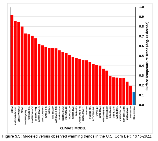
The big scary red bars show the model-projected warming in degrees C per decade. The boring little blue bar shows what actually happened. So, once again, it’s not uncertainty, it’s bias: The models warm too much and they do it on purpose.
But wait. There’s more. Having given readers insight into the many problems with climate models, the authors next turn to the record on extreme weather. As we shall next week.


"The team then look at Northern Hemisphere snow cover. Once again it’s no surprise for CDN readers to learn that average NH snow cover has been rising since the 1960s"
That statement is a lie snowfall has been decliing since the 1960s
https://climate.rutgers.edu/snowcover/chart_anom.php?ui_set=0&ui_region=nhland&ui_month=1
albedo changes do not explain nighttime warming which is the majority of the warming since 1975
The average of 1970s climate models when programmed with actual CO2 growth since the 1970s were very accurate: They predicted +0.2 C degrees warming per decade and that's exactly what happened. .... The DOE climate report is just as biased as any consensus climate report. Consensus scientists (95%?) were not allowed to contribute to the DOE report. The mirror image of consensus reports that do not allow skeptic scientists (5%?) to contribute
The "U.S. Warming Hole"
The Corn Belt is identified as one of only two places in the world that has not warmed significantly during the summer, a phenomenon known as the "U.S. warming hole".
Summer Cooling: Since 1973, observed area-averaged temperatures for the 12-state Corn Belt during the growing season (June, July, August) have shown a downward trend.
This is data mining and poor science
The authors obviously wanted to data mine to make the climate models look bad
Data mining is one method of scientific lying
Mr long-name: looking at the chart you provided shows a sharp drop in snowfall in the 90s, followed by a partial recovery. This is not 'a decline', which implies a steady downward progression. Choosing the word 'decline' is an intentional deception. There was a sudden shift due to whatever reason and it is not a 'tipping point'. This shift is not explained by climate scientists or models, they don't predict sudden shifts, only gradual changes, which does not match observations.
The steady CO2 growth does not match the 15-year hiatus since 2000 in global temperatures rising so you are also cherry-picking your data. This is the same thing as above: if you look at very long times, you may conclude that there is a trend, even when the shorter times show that there is no trend, only sudden shifts in weather patterns that stick around for a couple of years.
Lastly, if all the climate models fail to predict the corn-belt's failure to comply with orthodoxy, the models are wrong. Who knows where else they completely fail? A normal failure of a model would end up with about half of the models ending up being too cold and the other half being too hot. The point here is that they ALL end up too hot, which is a clear indication of programmed bias. If I were to make a model and this was the result, I would investigate the problem and start over from basic principles.
I've got an "I dare you" challenge.
By the end of the war, the reporting network was actually better than we have now. Set the initial parameters to 1945 and turn your models loose. See if they even come close to 2000, much less 2025.
The statement "snow COVER has been increasing" is not contradicted by "snow FALL has been decreasing".
Snow cover and snow fall are different things.